Cracked Rebranding
I proposed a full redesign for Cracked to reflect a new era for the comedy brand.
Position: Designer
My Role: Branding/Identity, Strategy
The Challenge:
Cracked’s visual identity no longer reflected where the brand wanted to go. Years after public layoffs damaged audience trust, the site was still visually tied to an earlier era of internet humor. As leadership shifted editorial direction and pursued larger advertisers, the brand needed a more cohesive and credible identity.
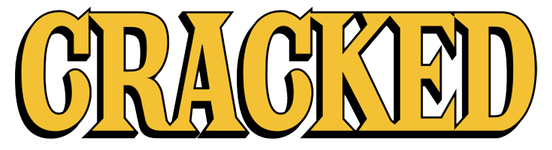
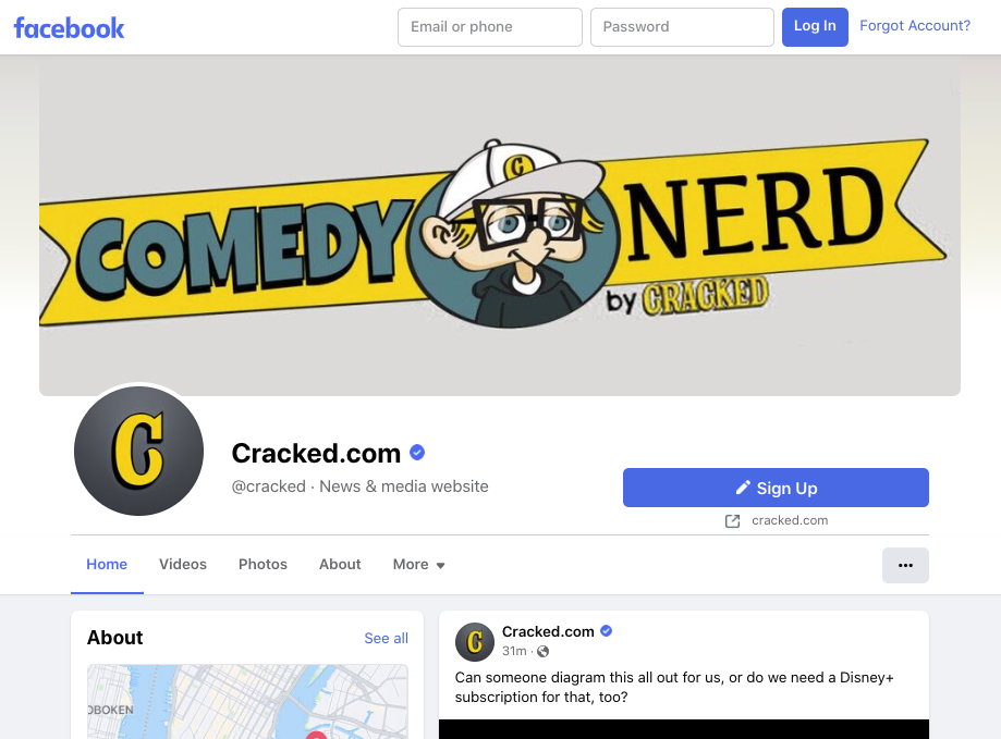
The logo had not been updated significantly since the print magazine was founded in 1958. The mustard accent color and stroke were outdated and difficult to use in digital applications.
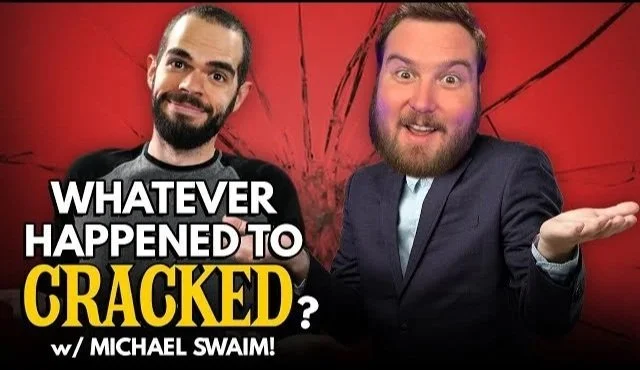
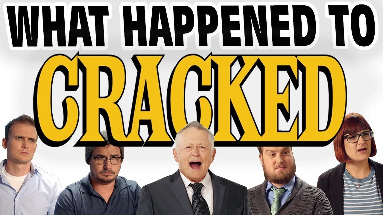
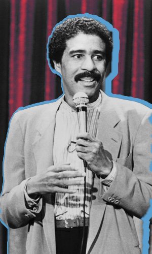
The logo no longer carried a sense of nostalgia and had instead become tied to lingering negative audience sentiment, as seen in its use within YouTube videos criticizing previous owners’ business decisions (above)
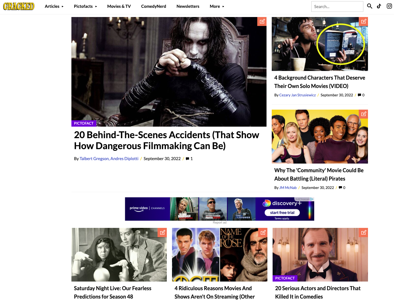
The existing layout no longer reflected contemporary editorial design standards.
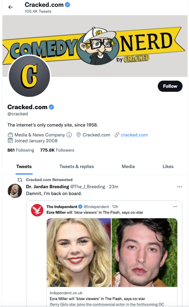
The branding was inconsistent. Although I had designed the updated Cracked mascot, it didn’t make sense in its current application across social media platforms.

The video side of the brand operated using a completely different visual language.
My Proposal:
As competing entertainment sites leaned into strong, professional imagery, it became clear the brand needed a more cohesive art direction to better match industry expectations to attract advertisers.
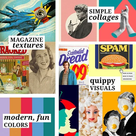
Working with the Editor in Chief who had announced a new editorial direction, we decided the brand’s imagery needed to be clever, playful, premium, & considered.
ABOVE: Mood board with images examples, from various sources.
My concept included updated contemporary colors (based on trend predictions), thoughtful imagery to pair with witty headlines, and magazine-inspired textures that nodded to Cracked’s print legacy.
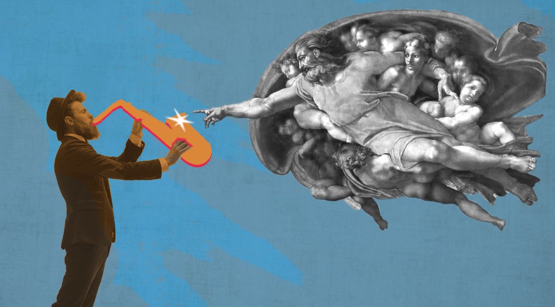
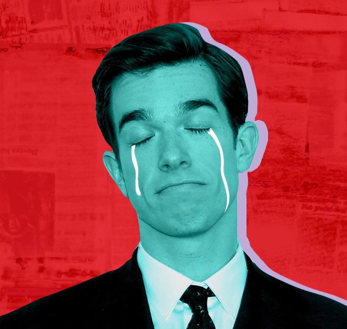

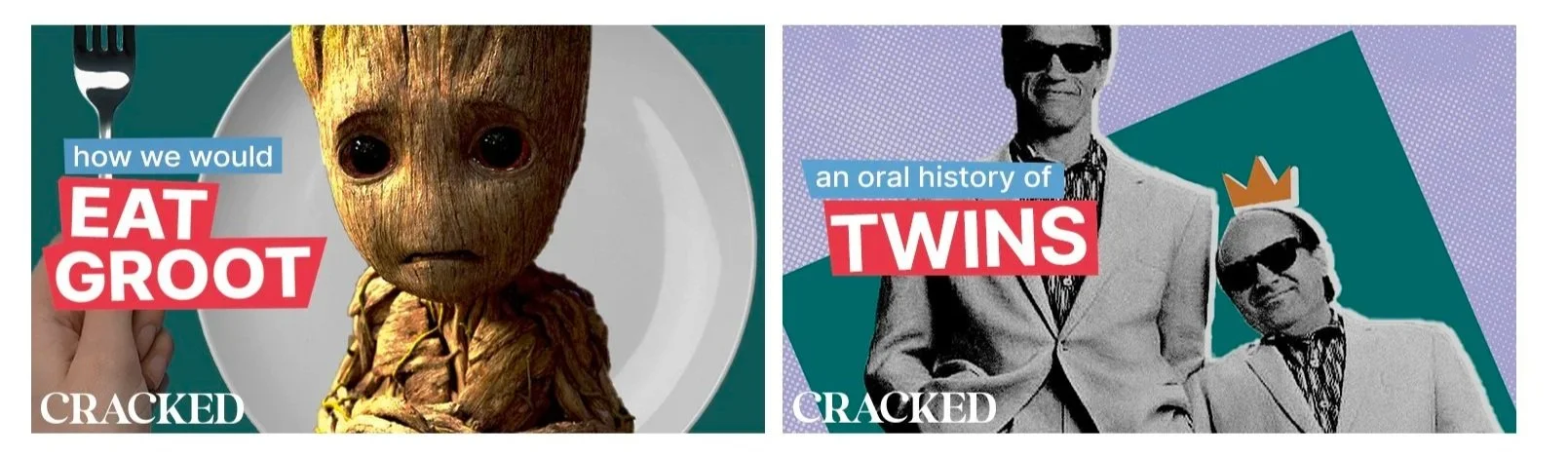
ABOVE: Examples of designs applying the new color palette and proposed art direction
I presented three logo options to stakeholders, depending on how willing they were to deviate from the pre-existing one.

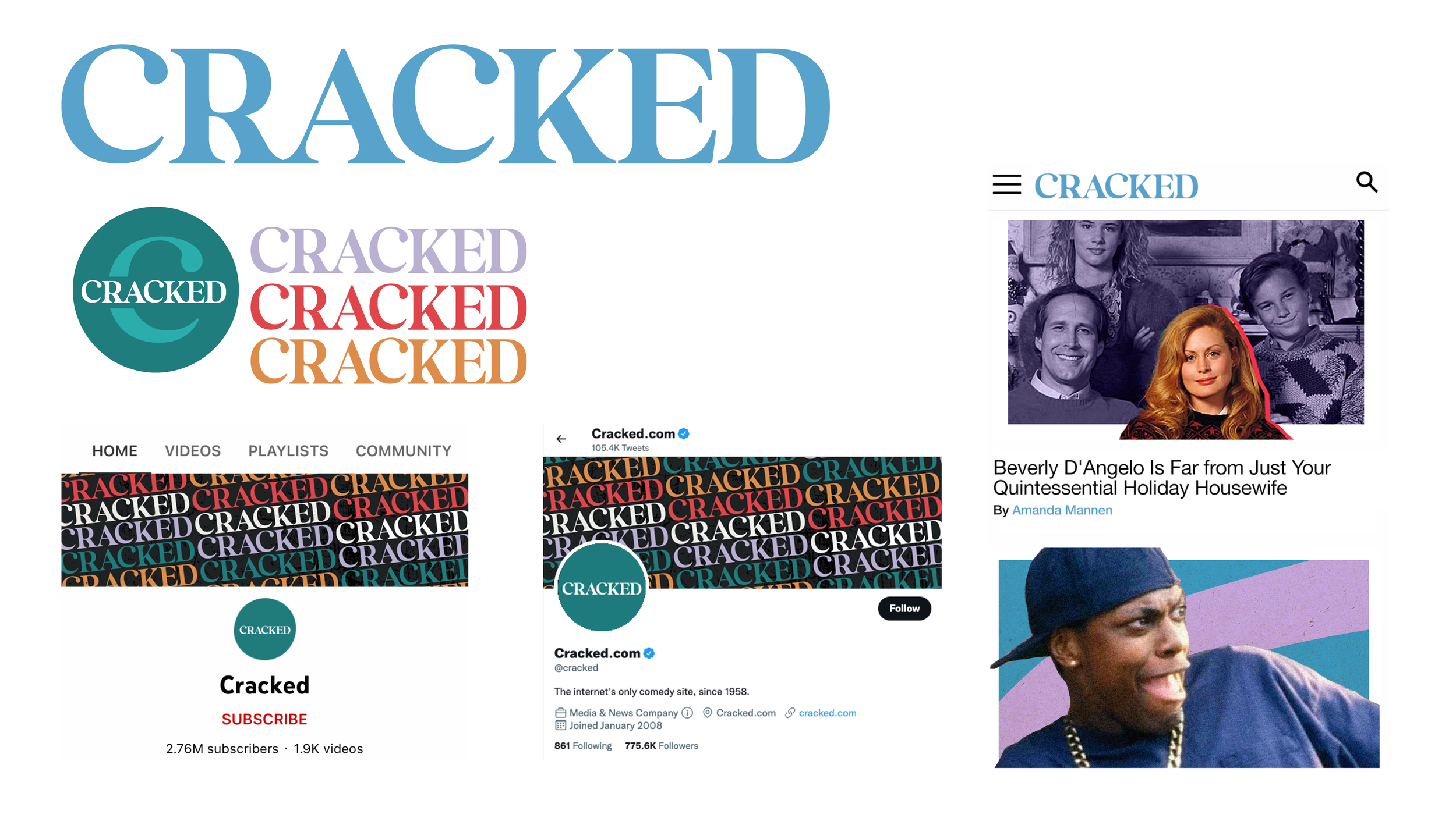
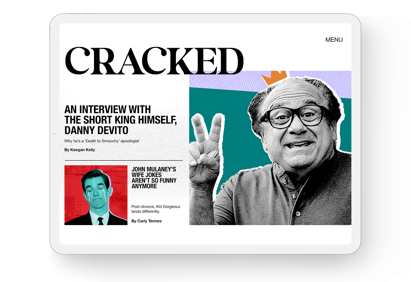
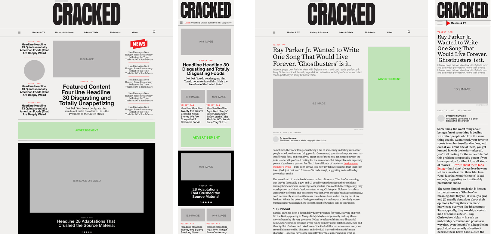
Site UX design proposal (first draft):
Video thumbnail examples:
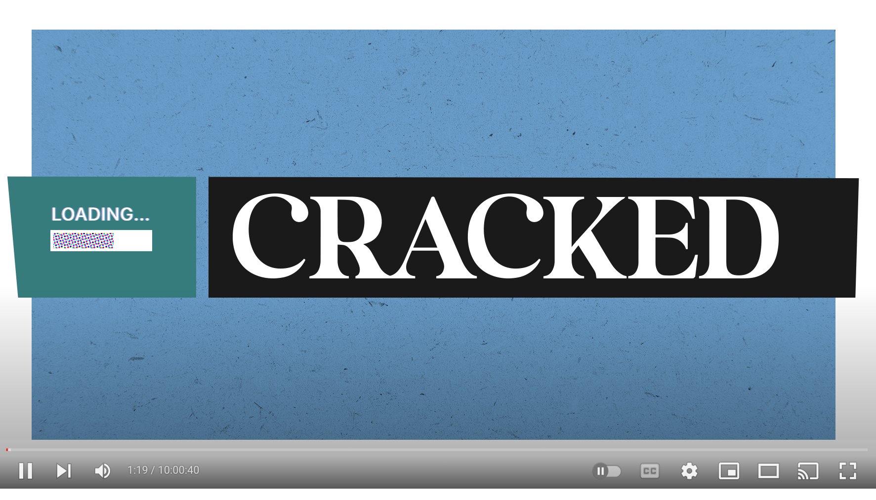
Proposed logo sting:
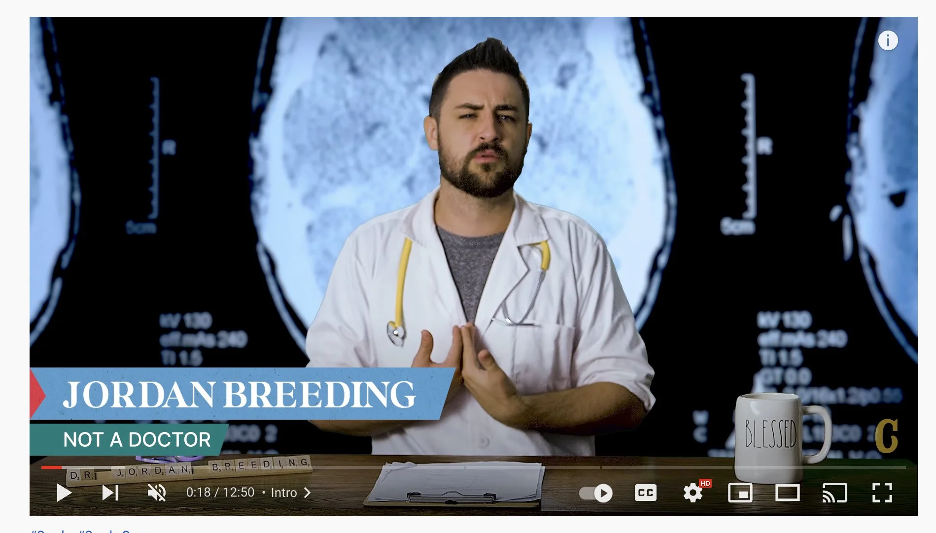
Lower third example:
Applied Design
Although the redesign was executed by an external team, I stayed closely involved through executing brand standards, running A/B tests, and adjusting designs to ensure the final site met the company’s quantitative goals, and ensuring Digital ADA compliance. My proposal ultimately inspired the update across all platforms, guiding both the visual and functional refresh and helping boost user engagement.
Position: Designer
My Role: UX Design Updating, Brand Style Guide Application